| Class | Property | Color token |
|---|
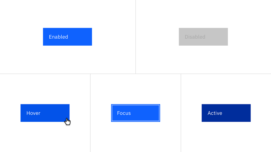
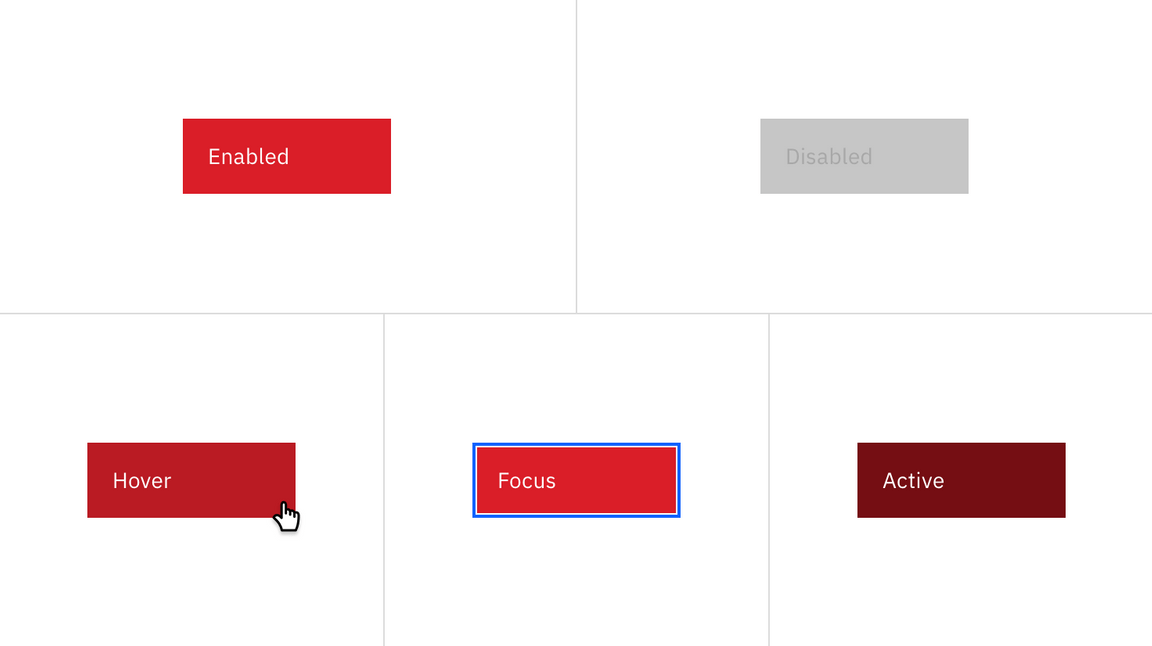
.bx--btn--primary | text color | $text-04 |
.bx--btn__icon | svg | $icon-03 |
.bx--btn--primary | background-color | $interactive-01 |
:hover | background-color | $hover-primary |
:active | background-color | $active-primary |
:focus | border | $focus |
:disabled | background-color | $disabled-02 |
:disabled | text color | $disabled-03 |
| Class | Property | Color token |
|---|
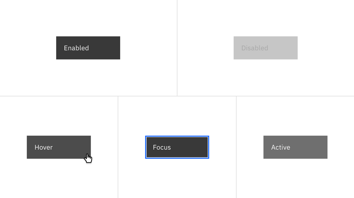
.bx--btn--secondary | text color | $text-04 |
.bx--btn__icon | svg | $icon-03 |
.bx--btn--secondary | background-color | $interactive-02 |
.bx--btn--secondary | border | $interactive-02 |
:hover | background-color | $hover-secondary |
:active | background-color | $active-secondary |
:focus | border | $focus |
:disabled | background-color | $disabled-02 |
:disabled | text color | $disabled-03 |
| Class | Property | Color token |
|---|
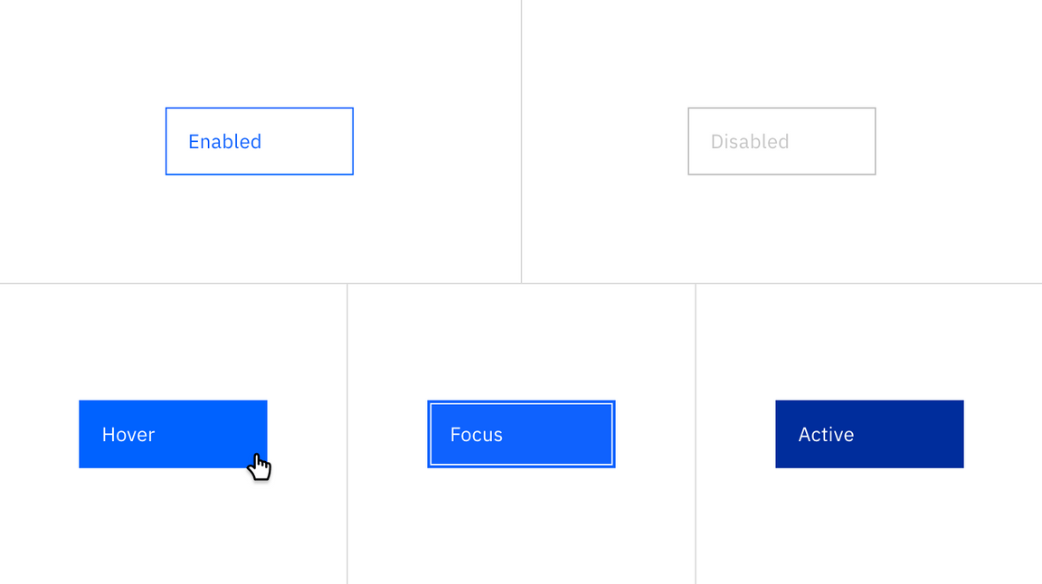
.bx--btn--tertiary | text color | $interactive-03 |
.bx--btn__icon | svg | $interactive-03 |
.bx--btn--tertiary | background-color | transparent |
.bx--btn--tertiary | border | $interactive-03 |
:hover | text color | $text-04 |
:hover | svg | $icon-03 |
:hover | background-color | $hover-tertiary |
:active | color | $inverse-01 |
:focus | background-color | $interactive-03 |
:focus | border | $focus |
:focus | color | $inverse-01 |
:disabled | background | transparent |
:disabled | border | $disabled-02 |
:disabled | text color | $disabled-02 |
| Class | Property | Color token |
|---|
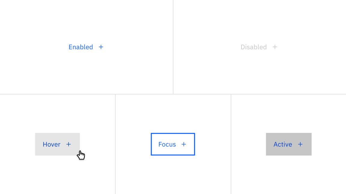
.bx--btn--ghost | text color | $link-01 |
.bx--btn__icon | svg | $link-01 |
.bx--btn--ghost | background-color | – |
:hover | text color | $hover-primary-text |
:hover | svg | $hover-primary-text |
:hover | background-color | $hover-ui |
:active | background-color | $active-ui |
:focus | border | $focus |
:disabled | text color | $disabled-02 |
:disabled | svg | $disabled-02 |
| Class | Property | Color token |
|---|
.bx--btn--danger--primar | text color | $text-04 |
.bx--btn__icon | svg | $icon-03 |
.bx--btn--danger--primary | background-color | $support-01 |
:hover | background-color | $hover-danger |
:active | background-color | $active-danger |
:focus | border | $focus |
:disabled | background-color | $disabled-02 |
:disabled | text color | $disabled-03 |
Button text should be set in sentence case, with only the first word in a phrase and any proper nouns capitalized.
| Class | Font-size (px/rem) | Font-weight | Type style |
|---|
.bx--btn | 14 / 0.875 | Regular / 400 | $body-short-01 |
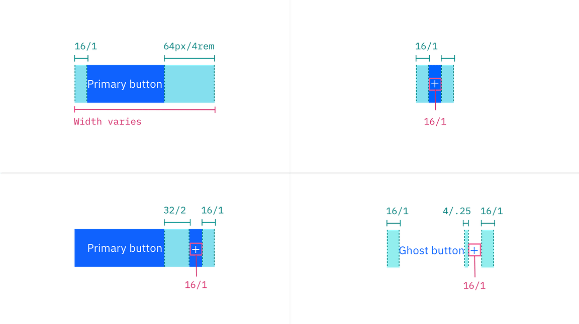
A button cannot have any element or text within 16 pixels / 1 rem of its borders. For button groups, the primary button is positioned on the outside of the set, while the secondary button is positioned inside. For a button with a glyph, the space between the button label and the glyph must be greater than or equal to 16 pixels / 1 rem. This is to accommodate for instances where two or more buttons with glyphs appear together.
| Class | Property | px / rem | Spacing token |
|---|
.bx--btn | padding-left | 16 / 1 | $spacing-05 |
.bx--btn | padding-right | 64 / 1 | – |
.bx--btn--sm | padding-left | 16 / 1 | $spacing-05 |
.bx--btn--sm | padding-right | 64 / 4 | – |
.bx--btn--ghost | padding-left, padding-right | 16 / 2 | $spacing-05 |
.bx--btn__icon | margin-left, margin-right | 16 / 1 | $spacing-05 |
svg | size | 16 x 16 | – |
Structure measurements for buttons | px / rem
The following specs are not built into any of the button components but are recommended by design as the proper distance between buttons.
| Attribute | Property | px / rem | Spacing token |
|---|
| External: button | margin | 1px | - |
| Button pairings | margin-left, margin-right | 0 | – |
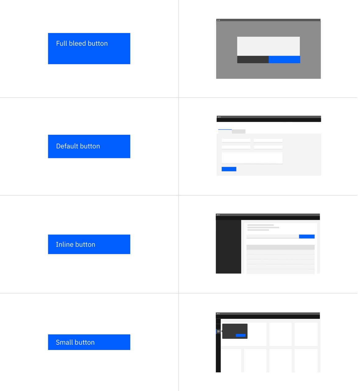
There are three common button sizes: default, inline, and small. Each button type can use any of these three sizes based on need. The fourth button size, full bleed, has a more reserved application and should rarely be used.
| Button size | Height (px / rem) | Use case |
|---|
| Full bleed | 64 / 4 | Use when buttons bleed to the edge of a component, like in side panels and modals. |
| Default | 48 / 3 | Use as primary page actions and other standalone actions. |
| Inline | 40 / 2.5 | Use when buttons are paired with input fields. |
| Small | 32 / 2 | Use when there is not enough vertical space for the default sized button. |
